




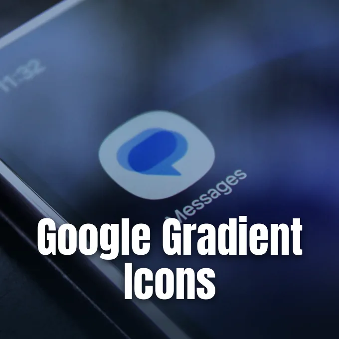
Google announced on November 2, 2026, that it has started rolling out refreshed icons for three core Android tools: the Google Messages app, Phone by Google, and Google Contacts. The update softens the look of each client with rounded outer borders, crisp contour lines, and soft color transitions instead of flat fills. While the visual facelift changes how these communication apps look inside the app tray, the underlying software features, messaging settings, and contact tools stay unchanged [1].
New Visual Identity for the Google Messages App
Google began reshaping its software branding last year when it introduced a fresh gradient style for the main “G” logo, pitching the look as a visual signal for an AI-first era. Workspace programs adopted the look earlier this year, giving Gmail, Drive, Docs, and Calendar matching gradient themes across their mobile interfaces. The latest release extends that same aesthetic direction to the daily communication apps that Android phone owners open every afternoon. As Sanuj Bhatia said on Android Police, the refreshed icons don’t look completely different from earlier versions, but subtle gradient shifts and distinct outlines make them appear cleaner on high-resolution screens [2].
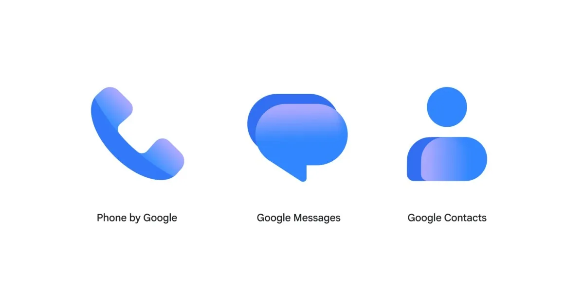
The Google Messages app keeps its familiar speech bubble symbol, but the interior geometry drops the intersecting shapes that defined the previous release. Instead of layered panels, a single blue bubble provides cleaner contours. Commenter Austin praised the presentation on 9to5Google, writing, “These are less visually cluttered than the old ones with the intersecting lines and hints of layering. They weren’t bad but I like these a lot better.” [3]
Japanese tech site Jetstream observed that the refreshed Google Messages design first arrived with app build v20261030_00 before Google published its broader announcement [5]. While beta testers spotted the package early, general phone owners must wait for Google to enable the visual flags through server updates or Play Store packages. Bhatia checked a Pixel 11 Pro handset right after the announcement and said the updated graphics had not appeared on that device yet. Staged rollouts mean that neighboring phones running the same software build can display different icon versions for several days [2].
Gradient Styling on Phone and Contacts
Phone by Google and Google Contacts share the same design language as the updated messaging client. Ryan McNeal reported on Android Authority that both apps shed their previous flat appearance in favor of soft gradients and rounded silhouettes. The telephone receiver icon uses a slightly curved handle with a blue gradient running from top to bottom [4].
Google product manager Shahram Izadi published the official announcement on November 2, 2026, outlining the ideas behind the visual changes. Izadi wrote that the new icons are “sharper and clearer” on phone displays because designers added a “subtle but crisp gradient with easily readable edges.” The post explained that customer feedback pushed the team to revise curvature and color balance so these utilities match the core Google logo. Izadi said that these three communication utilities help people stay connected every day, which makes visual harmony on Android home screens an important goal for the software team. By pairing defined borders with gentle gradient shifts, the graphics stay legible across different screen resolutions and display scaling modes [1].
The Verge tech reporter Emma Roth observed that the update trades the flat blue appearance seen in earlier releases for a soft gradient style that matches recent changes in Google software [8]. Droid Life writer Tim said Google is standardizing its icon set on Android devices, reducing the visual differences that used to define carrier and manufacturer skins. Instead of competing with contrasting palette choices, the three icons share unified shades of blue and white [7].



Beta Availability for the Google Messages App
Abner Li reported on 9to5Google that the updated artwork is already live for users enrolled in the Google Messages beta program on the Play Store. The server rollout will expand to general users over the coming weeks as Google pushes app updates through its standard store channels. Web users will also notice the refreshed branding in browser tabs soon. Google plans to deploy the updated graphics to contacts.google.com and messages.google.com/web so desktop sessions align with mobile devices [3]. Synchronizing web and mobile interfaces lets people who manage text threads from their computers see the same visual cues that appear on their smartphones.
Software releases from Google rarely reach every handset on the first afternoon. Jetstream confirmed that user feedback guided the timing of the refresh, with packages rolling out gradually to monitor visual rendering on diverse screen panels. Some handsets receive the revised assets quickly through background Play Store components. Others must wait for their regional staging group to open [5].
Early testing by tech writers shows that seeing the new icons on one phone doesn’t mean they will show up on a second device in the same home. Sanuj Bhatia said that his Pixel 11 Pro still displayed the previous icon pack hours after the official blog post appeared. Launcher caches and app store update intervals can delay how quickly icons refresh inside the app grid. Android users who want to check for the new graphics can visit the Play Store to see if a fresh Google Messages build is ready for installation [2].

Unchanged Core Features and Messaging Functions
Google reassured users that this visual refresh does not change any core features in the three communication applications. In its official announcement, the company stated, “Don’t worry, the functionality of these apps isn’t changing as a result of the new icons.” Users will still find their message threads, pinned conversations, and call history right where they left them [4].
Android Kenya discussed the wider mobile ecosystem and pointed to an amusing color contrast between rival smartphone platforms. Apple’s iMessage application uses a green icon despite showing blue conversation bubbles for native chats between iPhone owners. In contrast, the Google Messages app displays a blue icon but renders green bubbles when texting iPhone users over basic SMS channels. Android Kenya pointed out that Google spent years running public campaigns urging Apple to adopt Rich Communication Services (RCS) to bridge cross-platform messaging gaps between the two operating systems. Longtime observers found the inverted green and blue colors a notable talking point in mobile software history [6].
The visual nature of the update also means that Android system theming keeps working without interruption. Handsets running modern Android builds will continue applying dynamic color theming to the new icons when users enable themed shortcut palettes in system settings. Droid Life observed that the cleaner silhouette allows the phone software to generate cleaner monochrome variations during custom setups, keeping home screens looking balanced [7].
Consistency With Broader Android Ecosystem Changes
This update is the first coordinated redesign for Google communication apps since October 2022. At that time, Google introduced overlapping shapes meant to symbolize human conversation and adapted each client for the Material You design philosophy. Over the following four years, Google gradually shifted its software aesthetics toward cleaner outlines and subtle gradients. Moving away from the layered 2022 motifs allows Phone, Messages, and Contacts to look consistent with recently updated Google Workspace services [6]. The cleaner design helps the icons match the company’s visual ecosystem across tablets, foldable devices, and desktop browsers.
Google has pursued similar visual alignment in other Android components in recent seasons. The company took a comparable step when Google expands Noto 3D emoji across partner Android brands to give mobile conversations more dynamic expressions. Refreshing core utility icons complements those visual updates by providing a consistent presentation from the moment a user powers on a new handset [3].
The gradual distribution of the new icons will continue over the coming weeks as the Google Messages app, Phone by Google, and Google Contacts receive server-side activations through the Play Store [1]. While individual phone owners can’t rush the rollout on their specific devices, the visual update brings greater consistency to Google software on phones, tablets, and the web. Android users can expect to see these softer gradients and rounded curves settle into their home screens as communication apps update over the next few days [6].
- PRESS RELEASE Izadi, S. (2026, November 2). Google Messages, Phone by Google, and Google Contacts get new, updated icons. Google Blog. [Article Link]
- ONLINE NEWS Bhatia, S. (2026, November 2). Your Messages, Phone, and Contacts icons are about to look different. Android Police. [Article Link]
- ONLINE NEWS Li, A. (2026, November 2). Google rolling out gradient icon redesigns for Contacts, Messages, and Phone. 9to5Google. [Article Link]
- ONLINE NEWS McNeal, R. (2026, November 2). Don’t look now, but these Google apps are getting a facelift. Android Authority. [Article Link]
- ONLINE NEWS Jetstream. (2026, November 3). Official Refresh of Google Messages, Phone, and Contacts Icons Announced. Jetstream. [Article Link]
- ONLINE NEWS Android Kenya. (2026, November 2). Google Messages, Phone and Contacts Get New Icons on Android. Android Kenya. [Article Link]
- ONLINE NEWS Tim. (2026, November 2). Google’s New Icons for Phone, Messages, and Contacts. Droid Life. [Article Link]
- ONLINE NEWS Roth, E. (2026, November 2). Google’s Phone, Messages, and Contacts apps have a new look. The Verge. [Article Link]


