



Google Design published technical documentation detailing the extensive creative overhaul behind its new Noto 3D emoji library while expanding software availability beyond proprietary Pixel hardware across diverse partner platforms [2]. The company first introduced the dimensional glyph collection at Google I/O in May before releasing initial builds on Pixel 11 smartphones. The redesigned iconography is now rolling out across partner Android manufacturers and supported Google apps [1].
Noto 3D Emoji Rollout and Hardware Partners
Google began distributing the three-dimensional assets on the Pixel 11 series before broadening availability on September 17, 2026. Hardware partners receiving the updated glyphs include Nothing, Lenovo, Xiaomi, OPPO, OnePlus, realme, vivo, iQOO, HONOR, TECNO, Infinix, itel, and Motorola. Reporting from Android Authority confirmed that the rollout reaches hardware running proprietary skins rather than restricting the visual update to stock installations, confirming that partner brands can deploy the characters independently [1]. Stock firmware is unnecessary.
Ecosystem partners are already deploying the dimensional iconography across custom software layers. Nothing is integrating the characters through Nothing OS 5.0 (the latest platform upgrade rolling out to Nothing phones). Devices transitioning to the broader Android 17 platform rollout will display the glyphs across system menus, notification cards, and communication software without requiring third-party modification. However, Samsung remains noticeably absent from the announced partner roster. Samsung chose an alternative route. The South Korean manufacturer continues to supply proprietary emoji designs across its Galaxy product families rather than adopting Google’s standardized assets. Independent interface branding guides Samsung’s styling choices across diverse international smartphone markets [1].
Thirteen partner brands joined the deployment. Google confirmed that third-party manufacturers will distribute Noto 3D emoji directly through custom skin updates [1].
Google Design System and Emotional Clarity
Google Design structured the dimensional transformation of Noto 3D emoji around artistic intent rather than photorealistic replication. Creative teams drew, sculpted, and debated every single character by hand so that dimensional depth never compromised the expressive soul or fundamental identity of the original iconography. Handcrafted sculpting preserved character identity. The initiative prioritized emotional clarity over treating digital glyphs as miniature scans of the physical world. As Abner Li reported for 9to5Google, the design group used 3D rendering to give each character a physical body while relying on illustration to preserve its emotional soul [2].
Balancing dimensional volume with graphic expression required extensive experimentation across internal design studios. Designers debated every curve. Crafting dimensional curves for simple expressive symbols forced illustrators to evaluate how dynamic lighting gradients behave across diverse mobile screen panels while preserving consistent color saturation [2]. Stephen Schenck of Android Authority noted that Google published the technical breakdown at 3:04 PM ET on September 17 to clarify these aesthetic choices as hardware distribution expands [1].
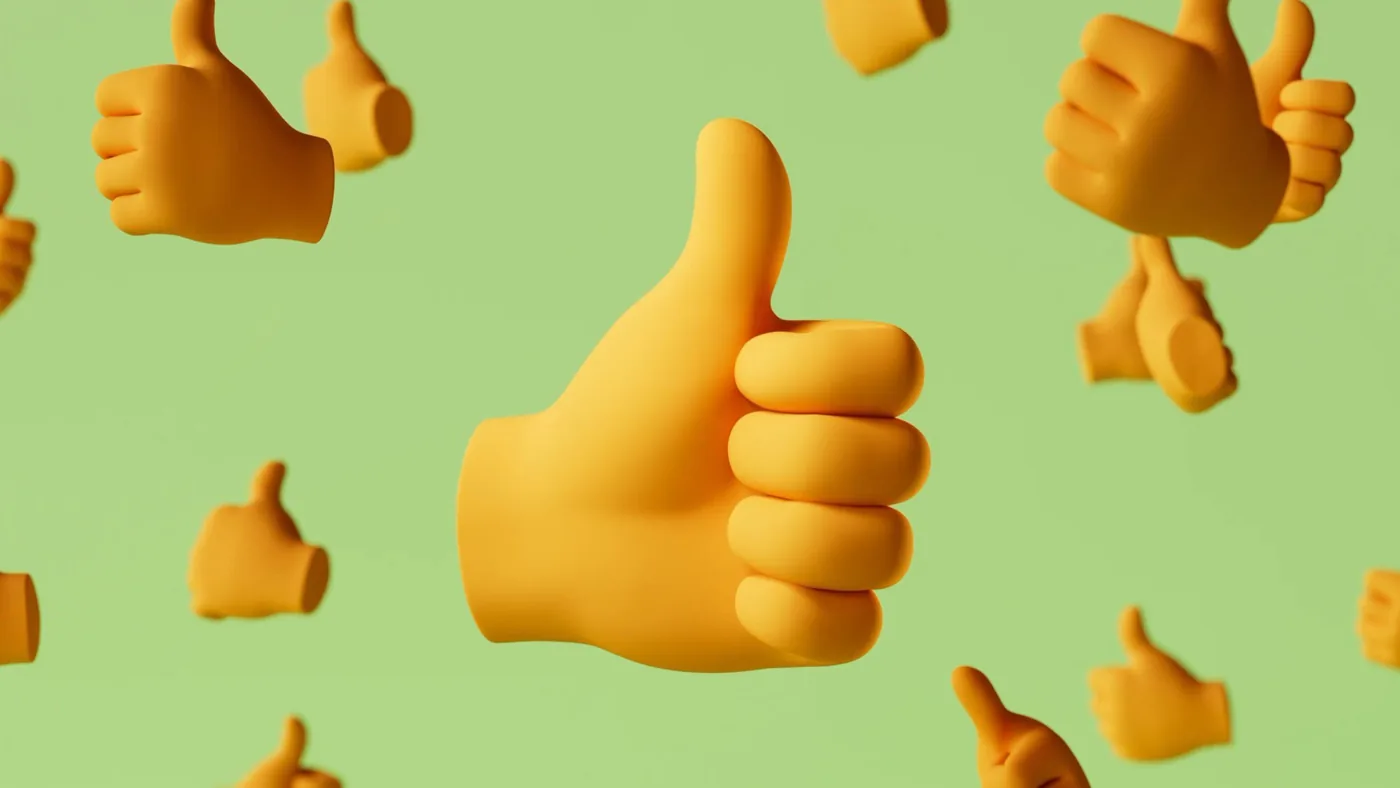
Visibility across diverse interface modes presented significant technical hurdles during cross-platform display tests. Contrast required careful tuning. Designers optimized every glyph for high contrast in dark mode interfaces while safeguarding visual legibility when scaled down to itsy, bitsy screen dimensions across varying ambient environments [1]. Mobile displays routinely present chat icons at compact footprints where excessive gradients can easily degenerate into muddy shapes. Google resolved this presentation challenge by eliminating unnecessary surface textures and focusing on distinct emotional signals, ensuring that subtle facial expressions remain instantly recognizable across varying hardware resolutions [2]. The resulting library maintains clear legibility across expansive desktop screens and miniature mobile notifications [1].

Minimal Geometry and the Three-Detail Limit
Cognitive research directly governed the geometric boundaries of the new emoji set. Google discovered that highly anatomical details like irises or nostril depth actually slow down how rapidly human brains process emotion, prompting directors to keep overall facial geometry strictly minimal. Anatomical excess impairs recognition speed. To preserve rapid communication, the creative team removed extraneous facial geometry (specifically iris definitions and nostril depth). Eliminating anatomical complexity enabled digital expressions to register instantaneously across varied messaging environments [2].
Displaying intricate three-dimensional models at 18×18 pixels creates severe perceptual challenges for interface engineers. Scale matters on compact displays. Google observed that background features, dense textures, and excessive props quickly become visual static that destroys basic comprehension on small mobile displays measuring just eighteen by eighteen pixels. To preserve immediate recognition, creative directors instituted a strict production mandate requiring every single glyph to feature at most three essential details to communicate what it is across compact chat windows. This deliberate restraint prevents compact chat threads from degenerating into illegible clutter [2].
Translating flat vector assets into three dimensions provoked unexpected structural questions across the design department. What does the back of a smiley face look like? Google addressed that question with humorous internal debates while resolving genuine anatomical oversights lingering from older collections. For example, the design team discovered that the legacy poodle emoji had inadvertently been drawn with only three legs in flat iterations. Dimensional modeling corrected those errors. The revised digital animal now stands on four sculpted limbs [2].

Complete Silhouettes Replace Floating Animal Heads
Depicting living creatures required a fundamental shift in digital anatomy. Google’s behavioral research revealed that people empathize far more with complete silhouettes than with isolated floating heads, especially when digital platforms depict real animals navigating conversational messaging spaces. Disconnected heads restricted expression. Mobile platforms previously relied on severed animal faces that restricted expressive potential to exaggerated facial grimaces without providing physical grounding. Full physical silhouettes allow creatures to communicate intent through authentic stance, paws, and dynamic bodily posture [2].
This anatomical principle builds on iterative design updates Google introduced over the preceding twelve months. Upon discovering user empathy patterns last year, artists redesigned the raccoon emoji to embrace its full mischievous self through an expressive physical stance rather than a detached floating face. Translating that complete silhouette into the Noto 3D emoji library allowed artists to preserve personality within compact chat windows [2]. Dimensional bodies now define the expanded animal collection across partner handsets [1].
Why did earlier digital glyphs struggle on small screens? Floating heads lacked physical context. Restoring paws, tails, and dynamic postures provides the narrative framing required for expressive communication. Complete animal bodies improve emotional comprehension across diverse mobile audiences [2].
Open Asset Repository and Samsung Customization
To support third-party developers and digital artists ahead of complete carrier deployment, Google published the complete collection to an open repository. Accessibility assists early adopters. A dedicated archive on GitHub (an exhaustive public repository containing high-resolution renders) allows users to search the full catalog and download graphical assets immediately. Built-in search tools enable enthusiasts to inspect individual characters before their specific handset manufacturer issues firmware updates [1]. The public archive provides transparent access to the complete dimensional library [2].
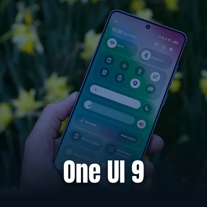
While Google expands distribution across thirteen hardware partners, Samsung maintains an independent visual strategy across its mobile ecosystem. Galaxy smartphones running custom interfaces bypass Google’s visual assets in favor of internal Samsung styling, as seen in the Samsung One UI 9 software enhancements developed for flagship hardware. Proprietary branding drives Galaxy design. This visual divergence highlights ongoing divergence in Android interface presentation, where individual manufacturers (including Samsung with One UI) balance platform conformity against proprietary interface branding. Google’s partnership approach supports broad collaboration with brands like Xiaomi and Motorola while allowing regional hardware leaders to preserve proprietary visual styling [1].
The expanded rollout of Noto 3D emoji marks a significant shift in Android’s visual communication standards [1]. By uniting three-dimensional modeling with strict geometric limits, Google produced an expressive visual language that scales smoothly from smartwatches to desktop displays while maintaining clear emotional readability [2]. Broader hardware availability across partner networks will determine how quickly these dimensional characters replace flat glyphs in everyday digital conversations [1].
- ONLINE NEWS Schenck, S. (2026, September 17). Google reveals how its new 3D emoji were designed, and which Android brands are getting them. Android Authority. https://www.androidauthority.com/noto-3d-emoji-rollout-3712554/ [Article Link]
- ONLINE NEWS Li, A. (2026, September 17). Google goes in-depth, and a bit NSFW, on Noto 3D emoji as Android rollout expands. 9to5Google. https://9to5google.com/2026/09/17/google-noto-3d-emoji-rollout/ [Article Link]


