




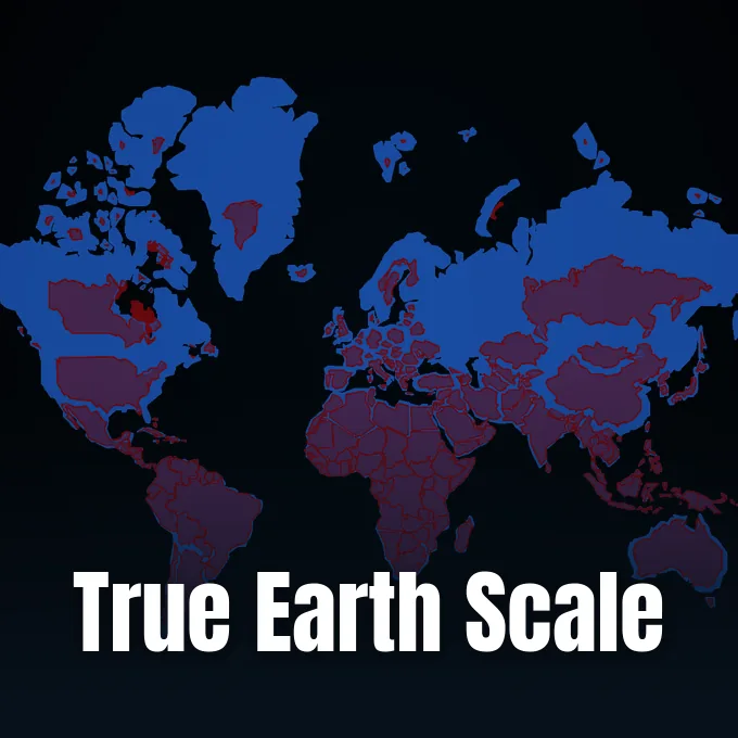
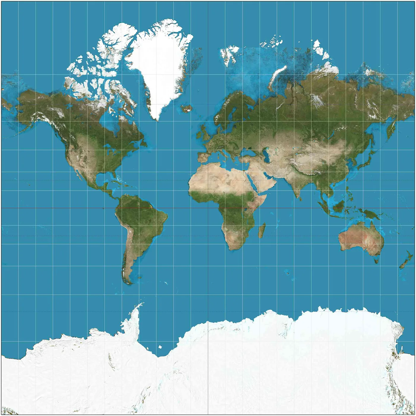
Why do classroom wall maps make northern nations look larger while shrinking tropical continents? For more than four centuries, schools and atlases have relied on the Mercator projection (a conformal cylindrical map created in 1569 for ocean navigation), which stretches polar landmasses [1]. That habit changed on September 4, 2026, when the United Nations General Assembly voted 164 to 1 to endorse a corrected world map based on the Equal Earth projection [3].
Why Did the UN Vote for a Corrected World Map?
The United Nations General Assembly adopted the resolution titled “Correct the map: rebalancing global cartographic representation and promoting equitable representation of the world’s regions, particularly Africa” on September 4, 2026 [3]. Delegates from Togo presented the measure alongside African Union member states and the Bahamas, framing the push for equal-area maps as an urgent matter of cognitive justice for students across the world [4]. The final tally recorded 164 votes in favor and six abstentions, with the United States casting the only dissenting ballot [1]. The cartographic reform parallels international data efforts, including when the UN Data Commons launched to unify global statistics across multilateral agencies [3].
The diplomatic effort grew out of a public campaign organized by Africa No Filter and Speak Up Africa under the banner #CorrectTheMap [5]. In February 2026, the African Union formally adopted the Equal Earth projection and urged member states to update their national curricula [6]. Moky Makura, executive director of Africa No Filter, said: “even narratives hiding in plain sight can be challenged and changed” [5]. African leaders argued that cartographic scale influences how students imagine global weight [4].
The resolution carries no enforcement mechanism [3]. In a 2026 preprint that has not undergone peer review, cartographer Sébastien Caquard explained that the resolution recommends equal-area maps without banning older projections, pulping atlases, or changing borders [2]. Ukraine abstained, noting that it feared the map could legitimize the Russian Federation’s 2014 annexation of Crimea [3].
How Does the Mercator Projection Distort Landmasses?
Gerardus Mercator published his map in 1569 to assist sixteenth-century sailors crossing oceans [1]. The projection plotted rhumb lines (lines of constant compass bearing) as straight lines on a grid [3]. Navigators could draw a straight pencil line between two ports, follow that compass angle at sea, and reach their destination safely. While Gerardus Mercator designed his nautical projection to preserve compass angles across vast ocean crossings, the resulting mathematics stretched high-latitude landmasses until northern continents appeared vastly larger than tropical landmasses. The technical compromise served navigators well [1]. But it distorted global proportions completely [4].
Scott Bell, who teaches geography at the University of Saskatchewan and conducts research at Harvard University, explained why flat maps distort reality. “When you take the surface of a round object and try to lay it flat, you’re going to have stark distortions,” said Bell. “Think of peeling an orange and try to flatten the peel, and you’ll see that you cannot flatten a sphere without stretching it. On the historic Mercator map, what is most accurate is at the equator, and as we move away from the equator, there’s more exaggeration in the portrayal of the places located in the north and the south” [1].
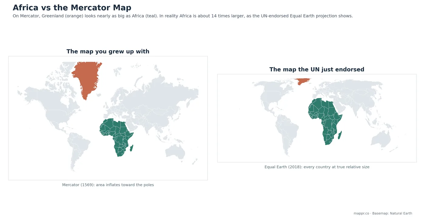
On Mercator charts, Greenland appears as large as Africa, even though Africa covers fourteen times more land area [4]. Alaska looks larger than Mexico, despite Mexico having more land. Just as researchers map complex primate cellular structures by balancing spatial detail, cartographers must choose which geometric properties to sacrifice [1].
How Big Is Africa on a Corrected Scale?
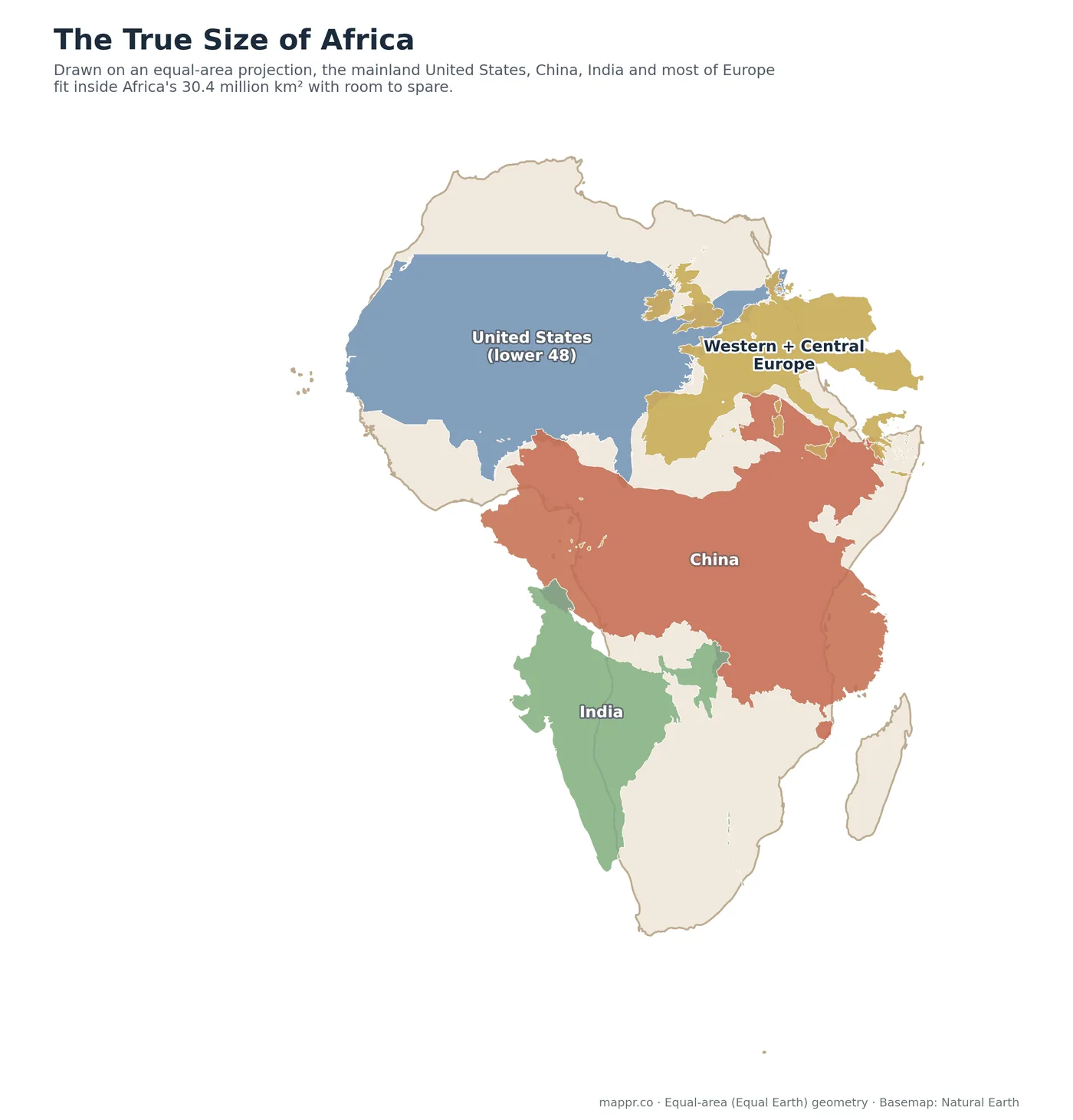
Africa spans 30.4 million square kilometers (about 11.7 million square miles), covering roughly 20 percent of Earth’s land area. It is the second-largest continent [1]. Greenland measures 2.17 million square kilometers [6]. Yet standard wall charts showed them at comparable sizes. Africa’s landmass exceeds the United States, China, and India combined by roughly one third [4].
In December 2010, computer graphics designer Kai Krause published an infographic titled The True Size of Africa to show the limits of standard world projections [5]. With an area spanning 30.4 million square kilometers, the African landmass is large enough to contain the contiguous United States, China, India, and most of Western Europe with territory left over. Madagascar, the Horn of Africa, and large sections of the Sahara remain unoccupied [4]. The graphic spread widely across schools, showing why a corrected world map matters [5].
Zoe Marks, Oppenheimer Faculty Director of the Center for African Studies at Harvard University, described the deeper meaning of this visual correction. “There’s something really beautiful and poetic in the simplicity of the adaptation that actually renders the spaces of various places more accurately,” said Marks. She noted that Africa will be home to the world’s only growing population by the year 2100. The demographic shift is coming [1].


How the Equal Earth Projection Balances Global Scale
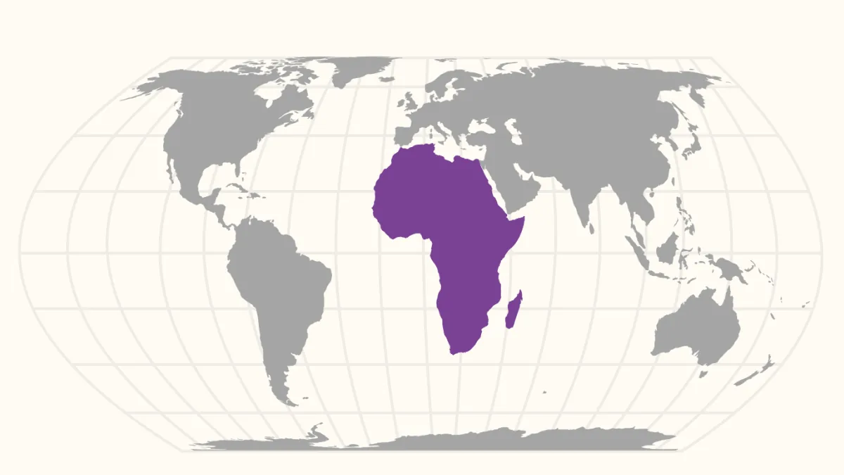
To solve polar distortion without warping continental shapes, cartographers Bojan Šavrič, Tom Patterson, and Bernhard Jenny created the Equal Earth projection in 2018 [1]. Equal Earth belongs to the pseudocylindrical equal-area projection family. Instead of compressing equatorial landmasses into severely elongated strips like previous alternatives, Equal Earth uses curved meridians and rounded poles to preserve proportional areas while keeping continental outlines visually natural and familiar [4]. Continents near the equator appear at their true proportional scale relative to polar landmasses [6]. Shapes stay recognizable [4].
On the Equal Earth projection, Africa occupies its rightful visual weight in the center of the world [4]. The United States appears at its actual proportion rather than the inflated 1.5 times scale seen on Mercator prints [1]. Canada, Russia, and Greenland shrink to their authentic physical dimensions [3]. A square inch on the map corresponds to the same physical area everywhere [6].
The shift has municipal precedent. In 2017, public schools in Boston, Massachusetts, retired Mercator wall maps in favor of equal-area alternatives so students could view fair representations of world geography [4]. International bodies are now expected to follow suit, giving classroom teachers a corrected world map that matches geographic reality [3]. School curricula are gradually adapting across multiple regions [6].
From Gall-Peters to Modern Map Debates
Efforts to fix Mercator’s bias began long before Equal Earth. In 1855, Scottish clergyman James Gall designed an equal-area projection. In 1973, German historian Arno Peters introduced a similar design, sparking disputes known as the “map wars”. Peters argued that Mercator’s map carried colonial ideologies by enlarging northern powers while diminishing former colonies in Africa, South America, and South Asia. The debate divided academic cartographers for decades [3].
Although humanitarian agencies adopted the Gall-Peters projection to counter Eurocentric bias, professional cartographers widely criticized its extreme distortion of tropical landmasses, comparing the stretched equatorial shapes to wet clothing hung on lines. Despite those visual flaws, Oxfam and UNESCO embraced the map. Peters showed that maps do not merely picture physical landscapes, but also produce political narratives and social attitudes. A related study shows how Aboriginal historians read colonisation by unpacking how settler institutions documented geography and territory [3].
Equal Earth avoided those disputes by balancing mathematical fairness with visual harmony [4]. Šavrič, Patterson, and Jenny softened continental outlines. Harvard Map Collection librarian Molly Taylor-Poleskey noted how stubbornly map habits persist. “There is something deeply ingrained in us about maps being carriers of truth more than other types of texts,” Taylor-Poleskey said. Cartographic habits run deep [1].
Why Digital Navigation Still Relies on Web Mercator
While classrooms shift toward equal-area maps, digital platforms follow different practical rules [3]. Applications such as Google Maps rely on Web Mercator [1]. Web Mercator divides Earth into square tiles, allowing mobile devices to pan and zoom quickly. Because navigation platforms need consistent local angles so that street intersections display as ninety-degree right angles at neighborhood scales, Google Maps continues to rely on the Web Mercator projection despite its global distortion [3].
David Weimer, a former librarian for cartographic collections at Harvard University, explained why Mercator remains practical for local routing. “The Mercator projection is very useful for a web map because you want your roads to be at the right angles, no matter where you are on the Earth,” said Weimer. “It doesn’t matter if Greenland is too big if what you’re interested in is how to get to the nearest coffee shop. You’d want to know what direction the road is going. In that sense the Mercator is very useful; it’s not obsolete by any means” [1].
The United Nations vote does not demand the removal of Mercator from marine charts or mobile phones. The UN Secretariat itself has frequently used projections like Robinson, Winkel Tripel, and Eckert IV. No national borders moved. But when schools teach global proportions, a corrected world map provides the honest foundation that students need [6].
- ONLINE NEWS Mineo, L. (2026, October 6). Correcting the world map. The Harvard Gazette. [Article Link]
- PREPRINT Caquard, S. (2026). Correcting the map: How a UN resolution marks a step toward decolonizing world maps. [Article Link]
- ONLINE NEWS Caquard, S. (2026, September 8). Correcting the map: How a UN resolution marks a step toward decolonizing world maps. The Conversation. [Article Link]
- ONLINE NEWS De Rosi, A. (2026, September 5). The UN’s New World Map: Africa’s True Size, Mapped. Mappr. [Article Link]
- WEBSITE Correct The Map. (2026, September 8). 164 Countries. One Map. A Truth Finally Told. Correct The Map. [Article Link]
- WEBSITE New World Map. (2026, September 8). New World Map 2026: What the UN Vote Actually Changed. New World Map. [Article Link]
APA 7: PerEXP Teamworks. (2026, October 7). How the Corrected World Map Fixes Africa’s Distorted Scale. PerEXP Teamworks.


