






CSS Grid and Flexbox represent complementary layout systems in Cascading Style Sheets, built to replace outdated techniques like table hacks and floats. While Flexbox arranges interface elements along a single linear axis, CSS Grid manages columns and rows at the same time. Choosing between css grid vs flexbox depends on whether a layout needs full page two-dimensional scaffolding or flexible component-level alignment. Understanding how both specifications distribute space helps developers write clean, semantic code that renders consistently in modern web browsers while avoiding brittle earlier layout hacks [1].
- Core Differences: CSS Grid vs Flexbox
- One-Dimensional Flow in Flexbox Layouts
- Two-Dimensional Controls in CSS Grid Layout
- Choosing Between CSS Grid and Flexbox for Page Structure
- Fraction Units for Flexible Track Sizing
- Browser Support Across Web Engines
- How CSS Grid vs Flexbox Handles Source Order
- Combining Both Layout Engines in Production
Core Differences: CSS Grid vs Flexbox
The fundamental distinction between css grid vs flexbox centers on dimensionality and structural authority. CSS Grid operates as a two-dimensional layout engine that controls both columns and rows within a unified coordinate system. The World Wide Web Consortium specification, edited by Tab Atkins Jr. and Elika Etemad, defines Grid as a top-down layout model where developers declare structural tracks on the parent container before children occupy designated areas [1]. In contrast, Flexbox functions as a one-dimensional system that calculates space along a single axis at a time. The flex container inspects the intrinsic content sizes of its direct children, distributing available space according to individual item rules along a single row or column. Grid defines the outer environment first, while Flexbox lets inner content negotiate layout boundaries.
Because Flexbox calculates space along one axis, child elements adjust their widths through flex-grow and flex-shrink properties. When items exceed container width and wrap onto a second line, each row computes item distribution independently. Surma noted for Chrome for Developers that flex containers can’t align items across multiple wrapped rows. If three items sit on the first line and two wrap to the next line, the bottom elements stretch without matching the column positions established by the boxes directly above them [4].
Web layouts benefit when developers use these tools together. Grid provides coordinates, overlapping layers with z-index, and rigid columns. Flexbox supplies fluid alignment for buttons, navigation links, and compact form controls. Neither system replaces the other in modern web production [6].
One-Dimensional Flow in Flexbox Layouts
Flexbox was designed to simplify linear interface arrangements that once needed clumsy CSS floats and clearfix workarounds. Setting display flex on a container establishes a main axis and an orthogonal cross axis, allowing developers to direct item flow horizontally or vertically without complex positioning calculations. Properties such as justify-content distribute space along the main axis, while align-items controls placement on the cross axis. For single-row components like navigation bars, search headers, or media cards, flexbox distributes gaps evenly without requiring manual width calculations. If an item needs extra room, flex-grow allows it to absorb remaining space automatically, making user interface controls adapt smoothly to dynamic text lengths on diverse screen resolutions [4].
The architectural boundary of Flexbox appears when an interface needs regular column rhythm over multiple lines. Enabling flex-wrap allows overflowing items to drop downward, but each line becomes an isolated layout context. The browser evaluates content sizes on the second line without consulting the widths of elements on the first line. When cards in a gallery contain variable headline lengths, adjacent wrapped rows drift out of alignment, creating an irregular appearance that breaks structured grid aesthetics [4].
Historically, web designers attempted to solve this misalignment by forcing fixed percentage widths onto flex items. That workaround reintroduces fragile calculations. Floats caused identical headaches when varying content heights disrupted layout flow in older browsers. True multi-column page structures demand a layout model engineered for simultaneous two-dimensional constraints [9].
Two-Dimensional Controls in CSS Grid Layout
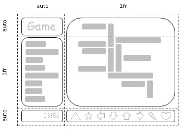
CSS Grid establishes structural harmony by managing rows and columns together within an explicit coordinate framework. When a container declares display grid, developers define column and row tracks using grid-template-columns and grid-template-rows. The browser forms an intersecting grid of numbered lines running from one to the total track count plus one, creating a predictable coordinate system for all descendant elements. Authors place child boxes precisely by referencing these line numbers with grid-column and grid-row. For example, a header can stretch over columns by declaring grid-column: 1 / 3, or an element can use span syntax such as grid-row: 2 / span 2 to cover two rows without specifying an explicit terminal line [4].
Beyond numerical line references, CSS Grid offers named areas through the grid-template-areas property. Authors write visual ASCII-like strings directly in CSS, assigning names like header, nav, and content to specific cells. Elika Etemad noted that this feature drew inspiration from Bert Bos’s early template layout experiments, giving designers an intuitive visual representation of page geometry directly within CSS stylesheets [6]. Child elements attach to these areas using grid-area, allowing responsive layouts to rearrange completely under media queries without changing HTML markup or relying on fragile scripting workarounds.
Grid also simplifies complex visual layering. Multiple items placed into identical coordinate cells can overlap using z-index for depth control. Automatic placement features via grid-auto-flow fill unoccupied spaces predictably. This coordinate predictability prevents layout breakage when dynamic content loads into viewports [1].
Choosing Between CSS Grid and Flexbox for Page Structure
Determining when to apply css grid vs flexbox depends on the scope of the layout problem. Whole-page scaffolding—comprising global headers, navigation sidebars, main editorial feeds, and persistent footers—demands CSS Grid. Because macro-layouts need two-dimensional boundaries, Grid keeps column tracks in exact mathematical relationships during viewport changes without collapsing when adjacent content lengths vary. Floats historically collapsed when sidebars exceeded main content heights, forcing developers to implement clearfix scripts and faux-column image tricks that broke easily under responsive conditions. Grid eliminates those past failures by maintaining consistent container geometry regardless of dynamic content fluctuations [9].
Which tool fits a compact user interface component best? Flexbox is the natural choice for micro-layouts within individual cards, media blocks, and navigation toolbars. Inside a header, links must distribute evenly while an icon sits flush against the left edge. A media card needs an author photo and username to stay vertically centered along a single row. Implementing CSS Grid for these small linear groups adds unnecessary complexity, because one-dimensional alignment requires neither column coordinate tracks nor explicit cell areas in multiple rows [4].
The cleanest web architectures nest flexbox containers inside grid cells. A page-level grid sets the overarching layout columns, while individual cards use flexbox to align their internal text and call-to-action buttons. Tab Atkins Jr. observed that both tools complement each other naturally in real-world production [6].


Fraction Units for Flexible Track Sizing
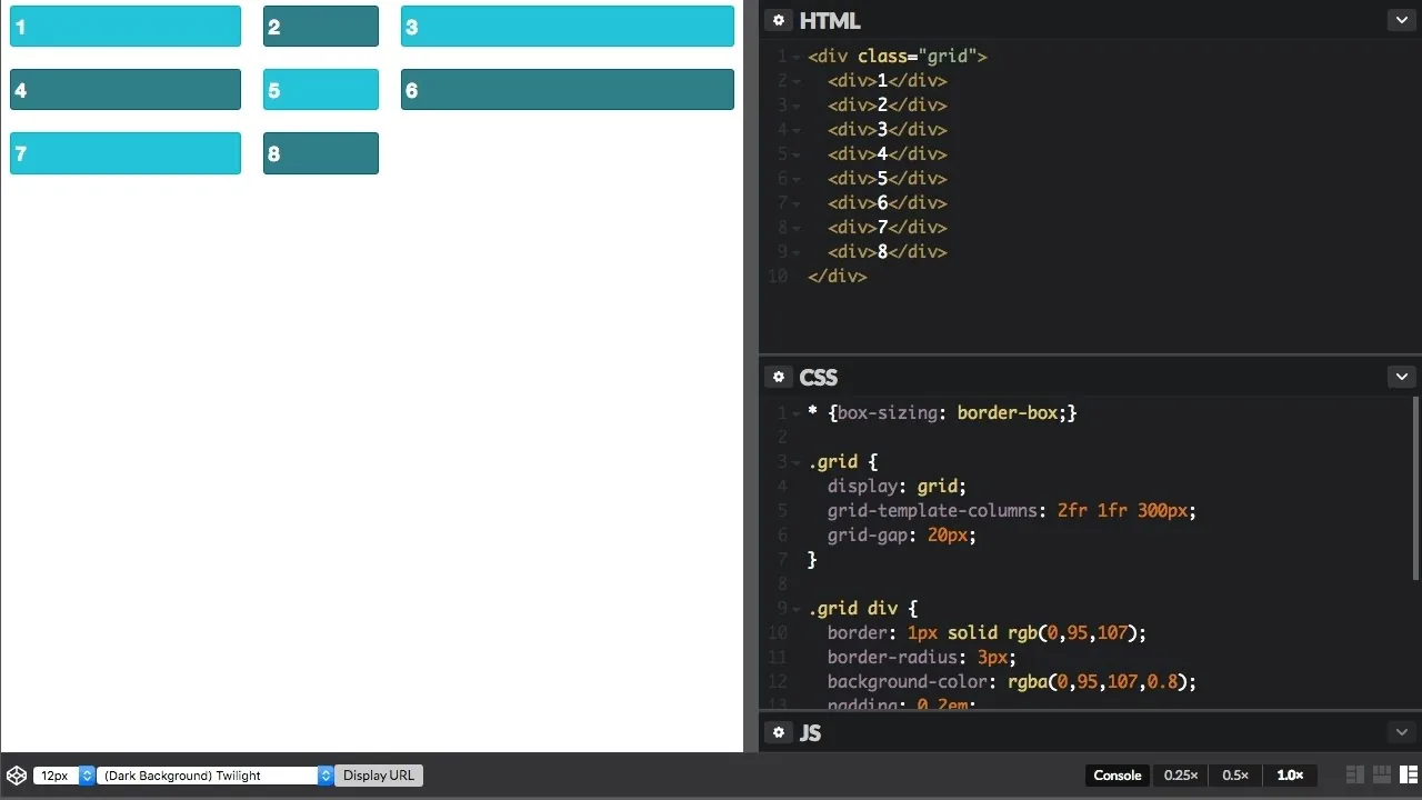
A standout feature of the CSS Grid specification is the fr unit, which represents a fraction of remaining free space in a grid container after accounting for fixed tracks. Before the fr unit, responsive designs relied on percentages, which caused layout breakage when combined with fixed pixel margins or gutters. Robin Rendle showed on CSS-Tricks that dividing four columns into 25% widths with a 10px column gap pushes the grid beyond 100% width, triggering horizontal scrollbars [8]. Rendle pointed out that writing 25% literally instructs the browser to “set each column to 25% the width of the viewport and have a 10px gap between them.” The fr unit solves this calculation error by subtracting gutters and fixed tracks first, distributing only the remaining space among fractional tracks.
The fr unit pairs effectively with the minmax() function to create resilient responsive columns. Surma explained that a track definition like minmax(200px, 3fr) enforces a minimum width of 200 pixels while allowing the column to absorb three fractions of free space on wider screens [4]. Developers also use the repeat() notation to condense repetitive declarations, transforming verbose percentage lists into compact rules like repeat(12, 1fr) for twelve-column grids. This syntax simplifies maintenance whenever interface requirements shift [8].
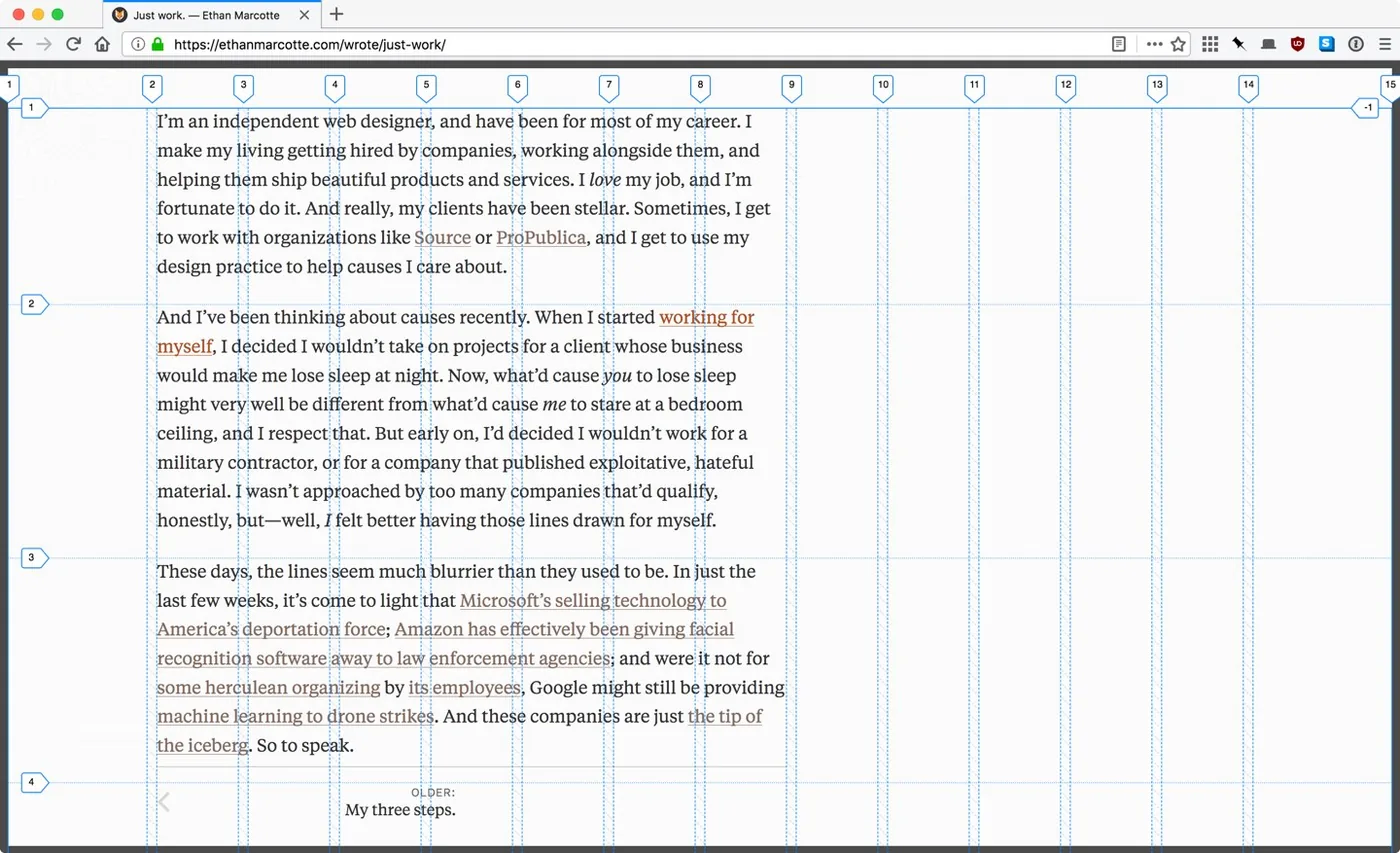
Ethan Marcotte implemented the fr unit on his personal website, configuring twelve central content tracks bracketed by two flexible 1fr columns for full-bleed graphics and flexible margins [7]. Marcotte reflected on how the specification simplified his workflow: “I’m doing considerably less complex math than I would in a float- or flex-heavy layout.”

Browser Support Across Web Engines
Standardization of CSS Grid succeeded through broad cross-browser collaboration. Grids had been discussed in web standards circles for two decades before reaching stable implementations. In 1996, Bert Bos, Håkon Wium Lie, and Dave Raggett proposed an early frame-based model, which Bos later developed into the Advanced Layout Module in 2005 [6]. In 2007, the W3C published a Working Draft for the CSS Grid Positioning Module Level 3, introducing grid-columns and relative asterisks under the 2004 W3C Patent Policy [3]. In 2011, Phil Cupp, Markus Mielke, and Alex Mogilevsky at Microsoft built a functional grid engine behind the -ms- vendor prefix in Internet Explorer 10, presenting their draft to the W3C in 2012 [6].
The CSS Working Group refined Microsoft’s proposal by adding Peter Linss’s suggestion for line-based coordinates and Tab Atkins Jr.’s updated algorithms to produce a flexible, standardized specification. In March 2017, Mozilla Firefox 52 and Google Chrome 57 shipped prefix-free CSS Grid engines. Apple Safari 10.1 enabled support shortly thereafter, and Microsoft Edge 16 arrived in October 2017. All major browser vendors rolled out stable implementations within seven months. Rachel Andrew and Jen Simmons drove community education, demonstrating real-world techniques that accelerated developer adoption [9].
According to Can I use data, modern releases in Chrome, Firefox, Safari, and Edge maintain full support for CSS Grid Level 1 without vendor prefixes or special browser flags. Legacy platforms like Internet Explorer 10 and 11 retain only Microsoft’s outdated 2011 syntax. Web authors targeting older clients used Modernizr 3.5.0 for feature detection, whereas Opera Mini remains the sole modern mobile engine lacking support [5].
How CSS Grid vs Flexbox Handles Source Order
A compelling capability shared by both css grid vs flexbox is the ability to decouple visual rendering from Document Object Model source order. Flexbox enables developers to rearrange items with the order property or invert linear flow via flex-direction: row-reverse. CSS Grid takes visual independence further by allowing items to be mapped to arbitrary grid lines or named areas anywhere in the container. While this decoupling empowers responsive designs to adapt layouts between portrait and landscape viewports, it introduces key accessibility obligations. If visual flow deviates heavily from the logical source structure, keyboard navigators and assistive technologies face confusing interaction barriers that disrupt normal reading order [1].
Screen readers and keyboard navigation sequences strictly follow DOM source order, ignoring visual positioning produced by CSS. In the W3C specification, Tab Atkins Jr. and Elika Etemad warned that visual placement must never substitute for correct semantic markup [1]. If a submit button is placed visually before input fields using grid coordinates, a keyboard user pressing Tab will still visit the fields first according to the DOM tree. Reordering should enhance responsive presentation without breaking the sequential logic required by assistive devices [4].

Why does source-order independence matter for responsive design? It allows developers to maintain a single accessible markup structure while rearranging visual components for different viewports. In portrait orientation, items stack vertically in source order. In landscape orientation, media queries shift those same elements into multi-column positions without altering the underlying document tree [1].
Combining Both Layout Engines in Production
In production web development, understanding css grid vs flexbox leads to architectures where both engines cooperate rather than compete. The arrival of CSS Grid Level 2 enriched this relationship by delivering the subgrid feature, authored by Tab Atkins Jr., Elika Etemad, Rossen Atanassov, and Oriol Brufau. Subgrid allows nested child elements to inherit and align directly with the track lines of their parent grid container. Before subgrid, cards arranged in a grid row couldn’t align their internal headers, paragraphs, and footer buttons unless developers imposed rigid fixed heights for the entire collection. With subgrid, nested elements share coordinate lines between sibling components while flexbox handles individual internal alignments [2].
Modern front-end frameworks reflect this division of layout responsibilities. While utility libraries like Tailwind CSS incorporate broad utilities for both CSS Grid and Flexbox, earlier frameworks such as Bootstrap 4 and Foundation 6 relied almost exclusively on flexbox [9]. Design systems now deploy CSS Grid for overarching page templates, dashboards, and photo galleries, while reserving flexbox for toolbars, navigation breadcrumbs, and button clusters. This balance prevents framework bloat and maintains lean stylesheets in complex web properties.
Web layout has transcended the era of table positioning and float clearfix hacks. CSS Grid controls two-dimensional structural page geometry, while Flexbox governs fluid one-dimensional component alignment. Embracing both specifications gives engineering teams the precision and flexibility needed to build resilient modern web applications [6].
- REPORT Atkins, T., Jr., Etemad, E. J., Atanassov, R., & Brufau, O. (2025). CSS Grid Layout Module Level 1. World Wide Web Consortium. [Article Link]
- REPORT Atkins, T., Jr., Etemad, E. J., Atanassov, R., & Brufau, O. (2023). CSS Grid Layout Module Level 2. World Wide Web Consortium. [Article Link]
- REPORT World Wide Web Consortium. (2007). CSS Grid Positioning Module Level 3 (W3C Working Draft). [Article Link]
- WEBSITE Surma. (2017). CSS Grid: Table layout is back. Be there and be square. Chrome for Developers. [Article Link]
- WEBSITE Can I Use. (2026). CSS Grid Layout (Level 1) browser support tables. [Article Link]
- ONLINE NEWS Gustafson, A. (2017). The Story of CSS Grid, from Its Creators. A List Apart. [Article Link]
- WEBSITE Marcotte, E. (2018). Fractional. [Article Link]
- ONLINE NEWS Rendle, R. (2017). An Introduction to the fr CSS unit. CSS-Tricks. [Article Link]
- WEBSITE Wikipedia. (n.d.). CSS grid layout. [Article Link]
Cover image: olivier gobet / Wikimedia Commons, CC BY 2.0


